Our appreciation of 2014 continues as our list of scene contributors shares its favorite album art of the year. We didn’t specify whether choices should be local or national, so we received a nice mix of both.
To check in with the other pieces of 2014’s “The Scene List,” head here. We’ll continue with choices on Nebraska songs, albums and shows through the first week of 2015. Thanks to all the participants, and feel free to share your own favorites in the comments.
* * *
Rebecca Lowry | All Young Girls Are Machine Guns
Crystals and Lasers by Bloodcow
I know [the album] hasn’t been released officially yet, but that Bloodcow cover art for Crystals and Lasers is pretty great.
* * *
Marq Manner | OEAAs Music Chair, Omaha Dispatch
Songs of Innocence by U2
I am going with the U2 album cover because it made me uncomfortable and made me cringe. Having worked in a record store for much of my life and seeing pretty much every album cover, that is a hard thing to do. I like the throwback to the early U2 album covers, the absurdity of it all and that it made me feel something even if it was not a positive feeling.
* * *
Ben Brodin | Recording Engineer/Producer at ARC Studios
Big Fear by Fax Holiday
* * *
Spencer Munson | DJ Spencelove, Marketing and Booking at The Bourbon
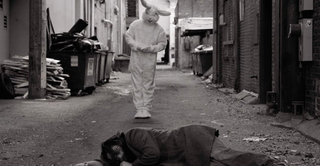
Backpacks and Mason Jars by Bonehart Flannigan
Beards and Bunnies.
* * *
Laura Fortney | Host of KZUM’s “Every Kind of Blue”
Good Sons and Daughters by Jack Hotel
I’m going to have to go with the Jack Hotel album Good Sons and Daughters here. TJ Templeton is a the talented local artist who painted the cover art, and his soft approach and colloquial style are the perfect complement to Voelker’s very personal style of songwriting. What’s more intimate than a naked woman smoking on a couch?
* * *
Ryan McKeever | Telepathy Problems, Staffers, Skeleton Man
Coaxed II by Coaxed
* * *
Raws Schlesinger | Plack Blague, Vickers
I can’t answer this question without nominating Plack Blague for having a studded jockstrap bulge on the cover of the Leather Band 7″. Some people say “It takes balls to do something like that”…well, duh!
Michael Todd | Former Hear Nebraska managing editor
St. Vincent by St. Vincent
2015 might be the year Marty McFly finds the future, but he’ll be lagging behind St. Vincent’s Annie Clark. This year, we were visited by a soulless, nearly colorless being that inhabits this precise, symmetrical album cover. Complementing a well-orchestrated, theatrical stage performance and a galvanizing, electric batch of songs, the artwork divinely defines this oracle’s telling.
* * *
Gunter Voelker | Jack Hotel, Sower Records
Backpacks and Mason Jars by Bonehart Flannigan
There were a few I loved — Bus Gas’ Snake Hymns had a beautiful cover, and Bud Heavy’s “limited edition” 3D sleeves were a brilliant stroke (they came with glasses) — but in the end I want to give it to Bonehart Flannigan’s Backpacks & Mason Jars. The front features an ostensibly wasted Jon Dell passed out in an alley, which is what draws your immediate focus, but then you notice a person-sized rabbit in the background. He (it’s a guy) is standing in front of a grease spot, which gives him the appearance of hovering. No explanation is offered. The cover is empty of text. The back shows a grinning Dell in a bed of bunnies. The center labels, A and B, are a sort of reverse take on the front: your immediate focus is on a rabbit, and then you notice Jon in the background. It’s hilarious, odd, disturbing, and matches Jon perfectly. Michael Thurber did the photography and Jason Morris did the layout.
* * *
Anna Gronewold | Hear Nebraska contributor
Tremors by SOHN
The art for Tremors, electric artist SOHN’s debut, is the lonely snowy tundra I’d expect from his music. It’s striking, abysmal and I’d buy it as a poster even if I hadn’t listened to the album’s 10th track on repeat the entire month of March.
* * *
Tom Flaherty | Teetah, Routine Escorts, //FITNESS founder
Zipacon by Anthony Naples
Album art really doesn’t ever do much for me, I’m mostly interested in what’s on the album itself. So I normally just look for something off-putting or humorous when it comes to my favorite album art. Anthony Naples’ Zipacon pulled that off perfectly this year.
* * *
Eric Nyffeler | Doe Eyed Design, Bus Gas
Primitive and Deadly by Earth
Perfectly psychedelic and dreamlike. I love seeing “heavy” bands using bold bright colors instead of relying only on dark, mute palettes.
* * *
Chris Dinan | Hear Nebraska contributor
We Are There by Sharon Van Etten
This album looks like it sounds. It’s like sitting in the passenger seat while Sharon is taking you on a cross-country roadtrip. As you navigate through the turns, it’s like you’re getting to know her more and more as the milage counter keeps going up.
* * *
Molly Misek | Hear Nebraska Spring 2014 intern
Youth Revisited by HERS
I saw a version of this album on vinyl and IT. IS. GORGEOUS. That’s all I’ll say.


